Dynamic forms are composite forms that allow you to present varying amounts of data to users.
Here at Ibmi Media, as part of our Server Management Services, we regularly help our Customers to perform Drupal related tasks.
In this context, we shall look into Dynamic Composite Forms.
More information about Dynamic Composite Forms ?
Basically, Dynamic forms are composite forms that allow us to present varying amounts of data to the users. Also, these forms can change their layout depending on the data they receive from the prefilling services at the time of rendering.
So when we generate a form with a separate request, it will produce a form with a different length or content
For example we want to display all purchase order records from a repository. Since the order count is a variable, we can accommodate it using a dynamic form.
Additionally, we can change the layout of dynamic forms at runtime using the script functionality embedded in the form template. For example, we can easily add or remove rows from a table using the controls.
What is Composite Element ?
The drupal Webform module features a form builder. Also, the Webform module supports every form element available in Drupal 8.
Form elements include:
1. Basic HTML: Textfield, Textareas, Checkboxes, Radios, Select menu, Password, and so on.
2. Advanced HTML5: Email, Url, Number, Telephone, Date, Number, Range, and more.
3. Advanced Drupal: File uploads, Entity References, Table select, Date list, and so on.
4. Widgets: Likert scale, Star rating, Buttons, Geolocation, Terms of service, Select/Checkboxes/Radios with others, and so on.
5. Markup: Dismissible messages, Basic HTML, Advanced HTML, Details, and Fieldsets.
6. Composites: Name, Address, Contact, Credit Card, and event custom composites
7. Computed: Calculated values using Tokens and Twig with Ajax support.
Composite elements are those that accept multiple inputs for the same field name.
We can build this using the Composite Element and some CSS. The situation where this breaks off is when the fields need to be dynamic. It means that one field depends on the other. Another issue with Default Composite Element is that at the moment, it doesn’t support using taxonomies, where the fields are stored. In such cases, we need to develop a custom module for a custom Element for the webform form builder.
Working with Multi-step webforms with a custom composite element ?
Drupal Webform module also offers a multi-step web form along with Ajax Support and Next/Previous buttons. According to our requirement, we needed a composite element that should use Conditional Form Fields. Here the Conditional Form Fields uses the #states property of Form API.
In addition to this, the fields in the composite should be radio buttons and select boxes.
Taxonomies is used to store the Product details. Then we use custom form fields to link different vocabularies. As a result, we built a custom composite element from the webform example. Then we add the fields as webform entity fields. However, these are not supported out-of-the-box.
For each form element in the composite above, we wrote custom codes and even added the #states API for the elements to be conditionally displayed and required based on other fields.
For Example;
The following is the code we used in the custom composite element for displaying the product list in the Select Box;
stom-element',
1 => 'js-form-wrapper'
];
$elements['product'] = [
'#type' => 'webform_entity_select',
'#title' => 'Product',
'#attributes' => [
'class' => [
0 => 'dynamic-product',
],
'data-side' => 'product_side',
'data-graft' => 'product_graft',
'data-type' => 'graft_type',
'data-webform-composite-id' => $html_id . '--product',
'data-webform-html' => $html_id
],
'#format' => 'label',
'#required' => FALSE,
'#required_error' => 'Please select a product from the list',
'#wrapper_attributes' => $eleAttr ,
'#validated' => true,
'#target_type' => 'taxonomy_term',
'#selection_handler' => 'views',
'#selection_settings' => [
'view' => [
'view_name' => 'products',
'display_name' => 'entity_reference_1',
'arguments' => [
]
]
],
'#after_build' => [[get_called_class(), 'product_states']],
];
Here we used #after_build key since the #states API didn’t work without it. It turned out, the field can conditionally be manipulated only if the #states API is triggered after building the form. The following is the #after_build callback function created in our module for the products select box, making it to be visible, enabled, and required when the graft type is ‘79’.
/**
* Performs the after_build callback.
*/
public static function product_states(array $element, FormStateInterface $form_state) {
$html_id = $element['#attributes']['data-webform-html'];
$element['#states'] = [
'invisible-slide' => [
'[data-webform-composite-id="' . $html_id . '--graft_type"]' => [
'value' => '79'
]
],
'disabled' => [
'[data-webform-composite-id="' . $html_id . '--graft_type"]' => [
'value' => '79'
]
],
'required' => [
'[data-webform-composite-id="' . $html_id . '--graft_type"]' => [
'!value' => '79'
]
],
];
$element['#states_clear'] = false ;
// Add .js-form-wrapper to wrapper (ie td) to prevent #states API from
// disabling the entire table row when this element is disabled.
$element['#wrapper_attributes']['class'][] = 'js-form-wrapper';
return $element;
}
Now we have a custom composite element. We can add it to the form and drag it to its corresponding location. We even designed a custom template to arrange the elements as shown in the composite element. Making use of the bootstrap library seemed to help with the responsiveness by using the .row & .col-md-* classes.
How to add multiple products in custom composite ?
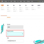
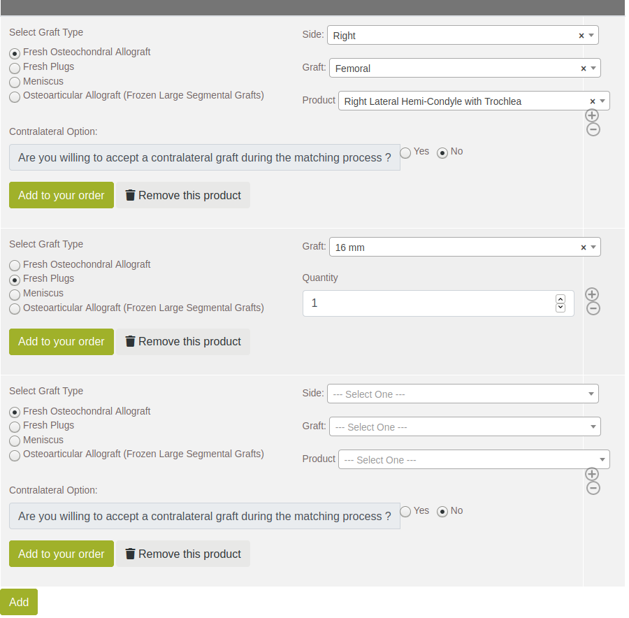
Since the custom composite element is designed in the form of table rows, the customer would see several rows while adding products. From an end-customer perspective, this is a disaster.
So we relied on jQuery to prevent this. We added two custom buttons in our template for the custom element, ‘Add to your order’ and ‘Remove this product’. These buttons were essentially triggering the ‘click’ event for the & icons are shown beside the column in the above image. We solved the problem with the long list of tables by adding a class ‘.hideme’ and setting the CSS property of the class to below.
.hideme {
display:none;
}
How to show Added Products ?
Sometimes, when the customer selects some products, let’s consider it to be some 5 products. After selecting the products, we hide them when ‘Add to your order’ is clicked by the customer. However, if the customer wishes to manage the products which he/she added to the form, there is currently no way to do that.
This forces the user in a one-sided form, which they no longer have control over. So there must be some method to show all the selected products, just like showing the products in a cart on an e-commerce website.
Luckily, Webform also has a computed twig element, where we can write Twig templates. It is mainly used for performing complex calculations dynamically within the form but can be used to do much more. The help data regarding the twig available under the element edit popup is quite vague, which resulted in fiddling with various options to get the correct element value that is entered by the user.
The value “{{ data }}” contains all the element values. So in order to access order name with key ‘order_name’ we call “{{ data.order_name }}” inside the twig template. Similarly, for a custom composite ‘products’ with value ‘product_name’, we use the “{{ data.products[0].product_name }}” to access the product name of the first row. This way, we can get all the values for the custom twig element using these twig variables.
As a result, we create a template for a basic HTML table. Then we substitute the elements from the computed element, to get the following table. Additionally, we add a ‘delete icon’ button so that the user can choose to remove a particular product if it is irrelevant for the particular order.
How to use jQuery Trigger for controlling actions ?
jQuery is a JavaScript library that is both efficient and simple.
We had four requirements for the dynamic element.
1. A newly added product needs to be populated in the table.
2. Delete a row from the selected products.
3. Update the Computed table with products
4. Hide the first set of elements.
We were on a multi-step ajax driven webform, the actions are already present for the user to perform, such as adding or removing products. The problem was that we cannot use those buttons for the user experience. So we used jquery trigger() function.
Using the Web Inspector tool, we were able to determine that the mouseover event triggers the add & remove actions. We created two new buttons to add and delete. Then for the onclick action, trigger the original action as seen below:
$(function(){
$('body').on('click', '.my-add-btn', function(e){
e.preventDefault();
$($selector).trigger('mouseover');
$($computed_twig).trigger('click');
});
})
Here, we attach ‘click’ to the body. Because the page is ajax driven, and the .my-add-btn class does not have any event listeners. By passing this element as a selector for the on() function, it will ensure that the action will be triggered regardless of AJAX dynamically generating the element.
We apply the same logic to the delete button, which triggers the mouseover on the actual delete button. Then it performs the deletion operation, though we had to use ajaxStart() and ajaxStop() global handlers to disable and enable the button during the deletion process.
In conclusion, we attach event handlers for the following buttons:
1. Add More Products
Triggers the ‘Add action’ for the composite element.
2. Add to Your order
i. Triggers form validation.
ii. Triggers the ‘Update Twig’ button click.
3. Remove this product
i. Triggers the click removing the current row ( before adding to order )
ii. Triggers the ‘Update Twig’ button click.
4. Delete individual products
i. Find the corresponding row from the custom composite
ii. Triggers the ‘delete’ button for that row
Working with Dynamic Select Fields ?
We use the Select2 library for improving the functionality of the basic select box. Also, it is helpful with the default search input box which we can use for filtering the results. Furthermore, the webform already included the library making it easier to set customize it.
Added to the helpful integration for remote data, we used the Ajax requests for setting the select options dynamically.
Drupal views are used instead of a custom module, to avoid the need to write custom modules to achieve the same output provided by the Views module.
How to use CSS to change the appearance ?
The composite element has many sections that are not needed in the form. So, using CSS, we hide those sections to have a more appealing form.
[Need urgent assistance with the Drupal related queries? – Our experts can help you. ]
Conclusion
This article will guide you on using dynamic composite #forms in a #Drupal #CMS. These forms change their layout according to the data they receive from the prefilling services at the time of rendering, so each separate request for form generation produces a form with a different length or content.
This article will guide you on using dynamic composite #forms in a #Drupal #CMS. These forms change their layout according to the data they receive from the prefilling services at the time of rendering, so each separate request for form generation produces a form with a different length or content.